
Design SubQuery Network metric dashboard

This case study outlines the UX design process for creating a network data metric dashboard for SubQuery. The focus was on developing a user-friendly, efficient, and insightful dashboard to assist users in involving and analyzing network performance.
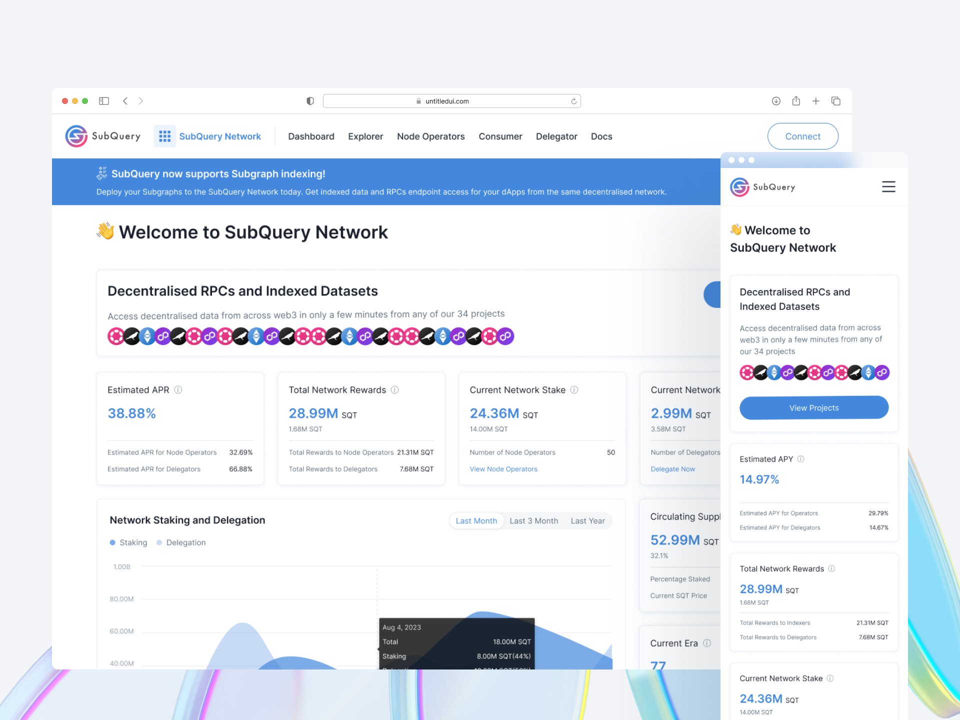
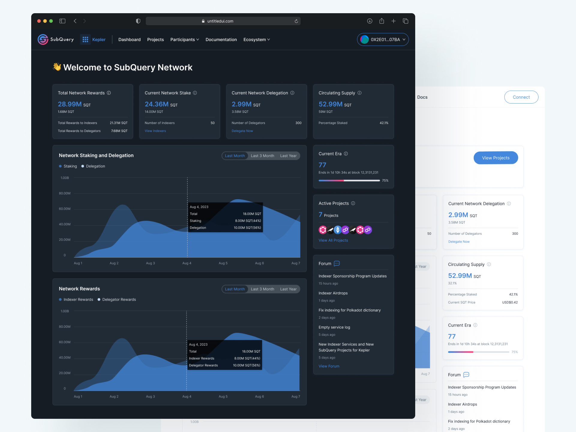
Design a comprehensive dashboard for SubQuery to display key network and useful data to people that are not indexers or logged in, e.g. the current Era state.
We are missing key Network metrics which can include:
Target User: Network participants: Indexers, Delegators, Web3 consumers,
Key Competitors: The graph https://thegraph.com
Users needed quick, real-time access to network data, customizable views, and the ability to easily interpret complex data.
The final UI design featured a clean and modern look, with a focus on ease of use. Data visualization was made a priority, with graphs and charts designed for quick comprehension. Streamlined interactions with tooltips, a better segmented control date selection for user to check historical data.
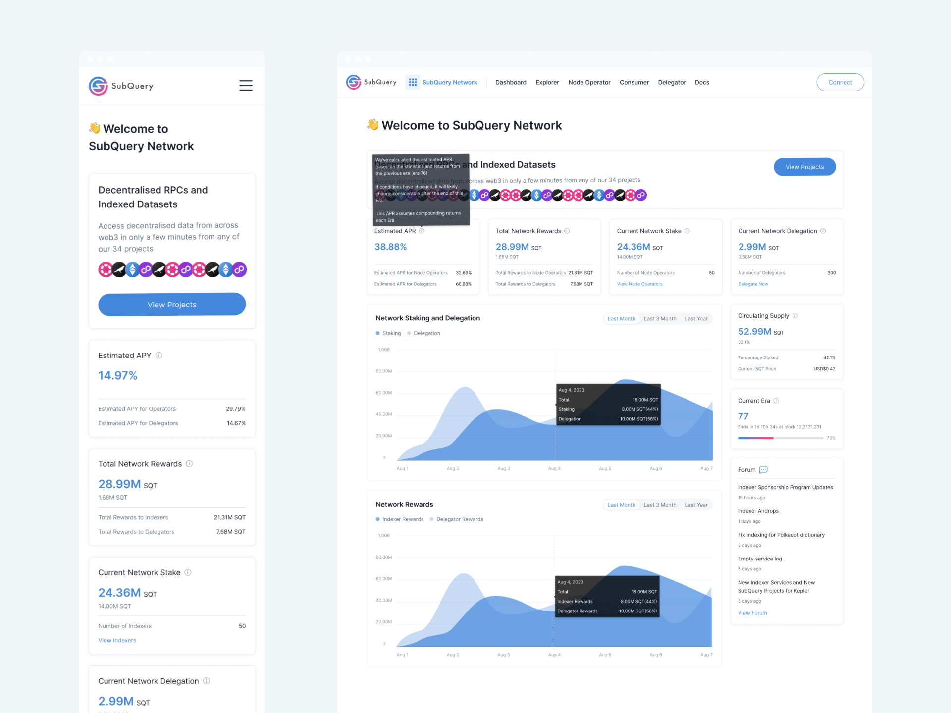
Complex Data Presentation: Designing a way to present complex network metrics in a manner that is easily understandable, even to users who may not have a technical background.
Real-Time Data Handling: Ensuring the dashboard can handle and display real-time data accurately and efficiently, which involves both design and technical challenges.
Responsive and Accessible Design: Creating a design that is responsive across various devices and accessible to all users.
